Built-in Views
When you set up the default Smile project you automatically get a number of built-in Views that are useful for most experiments. These include things like obtaining informed consent, presenting instructions, etc... This section describes these default built-in Views and provides an overview of how to customize them for your experiment.
Props
Each View can be configured with a set of props (basically input parameters) that control the behavior of the View. These props will be configured in the design.js. Examples of all of the props will be shown in the below examples.
Metadata options
Each View can also be defined with a set of metadata properties that control page access. These meta property will be configured in the design.js. Examples on all of the metadata properties will be shown in the below examples, and more information can be found here.
Overview of Built-in Views
| Name | Props | Description |
|---|---|---|
| Recruitment Ad | No | Landing page for participants |
| MTurk Ad | Yes | Interacts with the MTurk system |
| Informed Consent | Yes | Collects informed consent using a simple checkbox |
| Window Sizer | Yes | Verifies a given area of the screen is visible (with a more aggressive option that hides page content if the window is resized too small) |
| Simple Instructions | No | A simple sequence of pages for instructions |
| Instructions Quiz | Yes | A basic instructions quiz |
| Demographic Survey | No | A survey which collects some demographic info |
| Device Survey | No | A survey which collects some self-report about computer/device |
| Withdraw | No | A survey which processes a participant's request to withdraw from study |
| Debrief | Yes | A simple text View which describes the purpose of study |
| Feedback | No | A survey for soliciting structured and unstructured feedback on the study |
| Thanks Page | No | A thank you page |
These components ship inside the @nyuccl/smile-nuxt module and are auto-registered as global Vue components. That means in design.js you reference them by string name (e.g., component: 'InformedConsentView') — no import statement required. To override a built-in, drop a same-named .vue file in your project's components/ folder and yours wins (see Overriding Builtins).
Recruitment Advertisement
Component name: AdvertisementView (auto-imported)
Source: github
Typical accessibility: {allowAlways: true}
Before a participant can begin a study, they must first be recruited. The landing page for your experiment is the Advertisement View. This is the first thing that participants will see when they visit your experiment. The Advertisement View is a simple page that contains a title and an invitation to participate. There is a animated button which will take the participant to the next View in the timeline.
- The template can be edited to change the text.
- The logo image imports from
public/brain.svg.
Example design.js entry:
timeline.pushSeqView({
  path: '/welcome/:service?',
  name: 'welcome_anonymous',
  component: 'AdvertisementView',
  meta: {
    prev: undefined,
    next: 'consent',
    requiresConsent: false,
  },
})
The optional :service? segment lets the same route handle both anonymous arrivals and participants referred from external services like Prolific, Amazon MTurk, or CloudResearch. When the URL includes a service segment (e.g., /welcome/prolific?PROLIFIC_PID=...), the built-in view extracts the relevant ID and saves it with the participant's data — no separate beforeEnter hook needed.
MTurk Recruitment
Component name: MTurkRecruitView (auto-imported)
Source: github
Typical accessibility: {allowAlways: true}
On the Mechanical Turk, the platform lists possible HITs (Human Intelligence Tasks) and workers can choose to complete them. When browsing the listing participants see one "advertisement" view of the task in an iframe. When browsing in this listing the assignmentId is set to ASSIGNMENT_ID_NOT_AVAILABLE. If they accept the HIT, then the task begins and a new window opens with the actual task. At this point a valid assignmentId will be provided.
This View provides the logic to handle these two versions of the recruitment text. When the assignmentId is not available the participant sees the "recruitment" text with some information about the study. When they accept the HIT, they then see a new page with a button which will launch the Smile experiment in a new browser window.
- The template can be edited to change the text.
- The logo image imports from
public/brain.svg.
timeline.registerView({
  path: '/mturk',
  name: 'mturk',
  component: 'MTurkRecruitView',
  props: {
    estimated_time: api.getConfig('estimated_time'),
    payrate: api.getConfig('payrate'),
  },
  meta: { allowAlways: true, requiresConsent: false },
  beforeEnter: (to) => {
    processQuery(to.query, 'mturk')
  },
})
Informed Consent
Component name: InformedConsentView (auto-imported)
Source: github
Typical accessibility: {requiresConsent: false, requiresDone: false}
Most studies require some type of informed consent from participants. This is usually a short piece of text describing the study and the participant's rights and responsibilities. The Informed Consent View is a simple page that displays this text and asks the participant to agree to participate by clicking a checkbox. If the participant agrees, then the Informed Consent View sets a flag in the application state indicating that the participant has consented. Clicking a button continues to the next View in the timeline.
The text of the informed consent should be updated for each study. The starter ships with components/InformedConsentText.vue pre-created as a placeholder — edit it with your IRB-approved consent body. A fully formatted reference template is available alongside it as components/InformedConsentTextSample.vue; copy from it as a starting point if useful.
design.js registers the text component for both the consent page and the status-bar consent modal:
import InformedConsentText from './components/InformedConsentText.vue'
// ...inside createTimeline(api):
api.setAppComponent('informed_consent_text', InformedConsentText)
After a participant accepts the informed consent (usually the first few steps of study) they will see a button in the status bar that always lets them review the consent form. Clicking it pops up a modal that renders the same registered text component.
// consent
timeline.pushSeqView({
  name: 'consent',
  component: 'InformedConsentView',
  meta: {
    requiresConsent: false,
    setConsented: true, // set the status to consented after this route
  },
})
Window Sizer
Component name: WindowSizerView (auto-imported)
Source: github
Typical accessibility: {requiresConsent: true, requiresDone: false}
The window sizer displays a box with a configured size on the screen and asks the participant to adjust their browser window to that size so everything is visible. It looks like this:
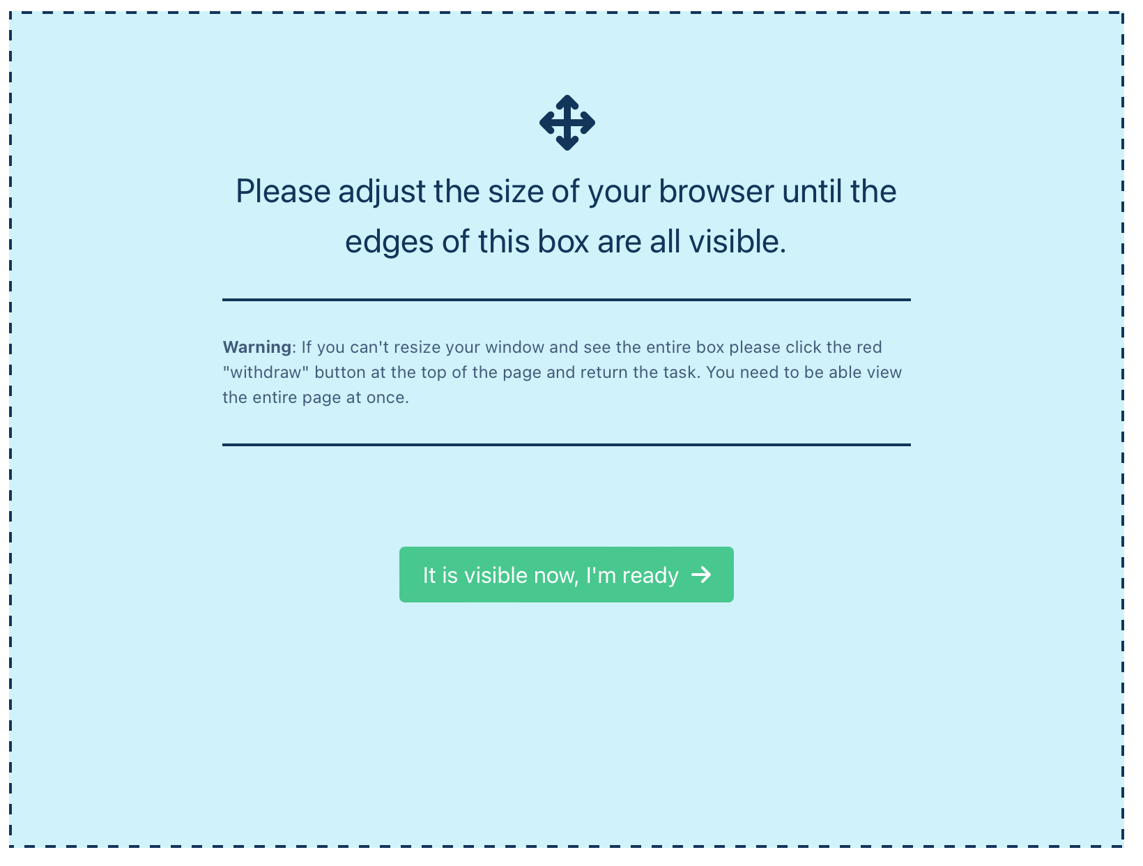
The size of the box is configured in your project's .env file using the VITE_WINDOWSIZER_REQUEST option. The default is 800x600 (800 pixels wide × 600 pixels tall). Change these as needed; restart pnpm dev for changes to env files to take effect.
In addition to appearing on the timeline in a particular place, the window sizer can also re-trigger whenever the browser detects the user resized below the requested size. To enable this behavior set VITE_WINDOWSIZER_AGGRESSIVE = true in .env.
Add it to the timeline like any other view in design.js:
// windowsizer
timeline.pushSeqView({
  path: '/windowsizer',
  name: 'windowsizer',
  component: 'WindowSizerView',
})
Simple Instructions
This page presents the instructions for the experimental task to the participant. If the experiment contains multiple conditions and each requires a unique set of instructions, the participant may be randomly assigned a condition with custom weights so that the Instructions View displays the correct text. This page is also always accessible such that the user is able to return to it if they do not pass the instructions quiz.
Component name: InstructionsView (auto-imported)
Source: github
Typical accessibility: {requiresConsent: true, requiresDone: false}
[TO DO: Add info about instructions]
// `api` here is the parameter passed into `createTimeline(api)` —
// no need to call useAPI() in design.js.

// assign instruction condition
api.randomAssignCondition({
  instructionsVersion: ['1', '2', '3'],
  weights: [2, 1, 1],
})

// instructions
timeline.pushSeqView({
  name: 'instructions',
  component: 'InstructionsView',
  meta: {
    allowAlways: true,
  },
})
Instructions Quiz
Component name: InstructionsQuiz (auto-imported)
Source: github
Typical accessibility: {requiresConsent: true, requiresDone: false}
The instructions quiz is a simple quiz that makes sure the participant has read and understood the experiment instructions. The user has to answer all the questions correctly before they can continue. If they get a question wrong, they are redirected to the timeline at the location specified in the returnTo prop, which is by default the instructions page, and will be asked to try the quiz again.
The quiz questions are configured in ./components/quizQuestions.js as an array of dictionary objects, where each dictionary represents a page of multiple questions. Each question has an id, a question text, a list of answers, and the correct answer(s). The field multiSelect can be set to true if a question has multiple correct answers.
export const QUIZ_QUESTIONS = [
  {
    page: 1,
    questions: [
      {
        id: 'example1',
        question: 'What color is the sky?',
        multiSelect: false,
        answers: ['red', 'blue', 'yellow', 'rainbow'],
        correctAnswer: ['blue'],
      },
      {
        id: 'example2',
        question: 'How many days are in a non-leap year?',
        multiSelect: false,
        answers: ['365', '100', '12', '31', '60'],
        correctAnswer: ['365'],
      },
    ],
  },
  {
    page: 2,
    questions: [
      {
        id: 'example3',
        question: 'What comes next: North, South, East, ___',
        multiSelect: false,
        answers: ['Southeast', 'Left', 'West'],
        correctAnswer: ['West'],
      },
      {
        id: 'example4',
        question: "What's 7 x 7?",
        multiSelect: false,
        answers: ['63', '59', '49', '14'],
        correctAnswer: ['49'],
      },
    ],
  },
]
The questions from ./components/quizQuestions.js are then imported and passed to InstructionsQuiz component as a prop (quizQuestions). The randomizeQuestionsAndAnswers prop is optional and defaults to true. This will randomize the order of the questions and answers on each page at loading time (meaning if the subject repeats the quiz multiple times, the order of the questions and answers will be different each time). If set to false, the questions will be randomized in the same way each time the quiz is taken.
// import the quiz questions (custom data lives in your project)
import { QUIZ_QUESTIONS } from './components/quizQuestions.js'

// instructions quiz
timeline.pushSeqView({
  name: 'quiz',
  component: 'InstructionsQuiz',
  props: {
    questions: QUIZ_QUESTIONS,
    returnTo: 'instructions',
    randomizeQandA: true,
  },
})
Demographic Survey
Component name: DemographicSurveyView (auto-imported)
Source: github
Typical accessibility: {requiresConsent: true, requiresDone: false}
The demographic survey is a simple survey that asks participants to provide some information about themselves. This is important for many reasons. For example, it is often important to report information about the demographics of the participants in a study (age, gender, country, primary language, etc...). In addition, it is useful to know if a subject is color blind in case the studies relies on color information.
When the participant was recruited via Prolific (i.e., api.getRecruitmentService() === 'prolific'), the first page of the survey swaps the date-of-birth picker for an Age dropdown (years, 8–110). This is required because Prolific's Terms of Service prohibit collecting participants' date of birth. The two inputs are stored in separate keys on the recorded page data — dob for the date picker, age for the dropdown — so analyses can unambiguously tell which input mode produced a given row.
timeline.pushSeqView({
  path: '/demograph',
  name: 'demograph',
  component: 'DemographicSurveyView',
})
Device Survey
Component name: DeviceSurveyView (auto-imported)
Source: github
Typical accessibility: {requiresConsent: true, requiresDone: false}
The device survey askes participants to provide some information about their computer/tablet/etc... This is important because sometimes the information obtained automatically from the browser is incorrect. It is also sometimes impossible to know aspects of a users computer setup. For instance, it might be important to know what type of pointer device a participant is using (e.g., mouse, trackpad, touch screen). This information is useful for debugging and for understanding the data and analyzing it depending on your research question. The default survey asks for the following information:
- What type of device are you using? (e.g., desktop, laptop, tablet, phone)
- What type of internet connection are you using? (e.g., wifi, ethernet, cellular)
- How good is your internet connection today? (e.g., good, poor)
- What webbrowser are you using? (e.g., Chrome, Firefox, Safari, Edge, other)
- How did you move the cursor? (e.g., mouse, trackpad, touchscreen, other)
- Are you using any assistive technology? (e.g., screen reader, magnifier, other)
- Did you use any tools to help you complete the task? (e.g., calculator, notes, browser extensions, AI tools, other)
If you want this to be the last View in the study you can set the setDone meta field.
timeline.pushSeqView({
  path: '/device',
  name: 'device',
  component: 'DeviceSurveyView',
  meta: { setDone: true }, // optional if this is the last form
})
Withdraw
Component name: WithdrawView (auto-imported)
Source: github
Typical accessibility: { requiresWithdraw: true }
As part of most IRB protocols, participants should be able to withdraw from a study at any time for any reason. Online, this is as simple as closing the browser window and moving onto something else. However, Smile provides a simple and clear way for a participant withdraw at any time from a study, while also providing feedback about why they are withdrawing.

When participants click this button (only appears after accepting the informed consent), then they are presented with a form, including several optional questions about why they are withdrawing and their contact information (e.g., for receiving partial compensation). As a side effect of
When they submit this form, they will be taken to a final page asking them to return the task/HIT. It is the responsibility of the experimenter to monitor withdraws and to try to contact the participant if needed for partial compensation.
// withdraw
timeline.registerView({
  name: 'withdraw',
  meta: {
    requiresWithdraw: true,
    resetApp: api.getConfig('allowRepeats'),
  },
  component: 'WithdrawView',
})
Debrief
Component name: DebriefView (auto-imported)
Source: github
Typical accessibility: {requiresConsent: true, requiresDone: false}
The debrief page displays the text that explains the purpose of the experiment and provides the participant with any additional postfacto information about the task they just completed. The text can be customized in components/DebriefText.vue in your project, and this page will transition the user to their post-experiment surveys.
// at the top of design.js — DebriefText is your custom .vue file
import { markRaw } from 'vue'
import DebriefText from './components/DebriefText.vue'

// debrief
timeline.pushSeqView({
  name: 'debrief',
  component: 'DebriefView',
  props: {
    debriefText: markRaw(DebriefText),
  },
})
Thanks
Component name: ThanksView (auto-imported)
Source: github
Typical accessibility: {requiresDone: true}
// thanks
timeline.pushSeqView({
  name: 'thanks',
  component: 'ThanksView',
  meta: {
    requiresDone: true,
    resetApp: api.getConfig('allowRepeats'),
  },
})
Feedback Survey
Component name: TaskFeedbackSurveyView (auto-imported)
Source: github
Typical accessibility: {requiresConsent: true, requiresDone: false}
The task survey asks some simple questions about the participant's experience in the task. The questions gauge how enjoyable and challenging the task was and offer a space for the participant to provide general feedback and comments on issues and improvements.
If you want this to be the last view in the study, you can set the setDone meta field.
// feedback
timeline.pushSeqView({
  name: 'feedback',
  component: 'TaskFeedbackSurveyView',
  meta: { setDone: true }, // optional if this is the last form
})
Navbars and Modals
In addition to these builtin Views, Smile also provides a few components that appear on the main App and are thus visible on every View on the timeline. These provide information that is useful to participants at any moment in the task. For example, the Status Bar provides a way for participants to withdraw from a study at any time, report an issue, look at the informed consent form again. These components are called "Navbars" and aren't arranged on the timeline — they're rendered globally by the module's layouts.
In addition there are a few modals that are used to collect information from participants when they are withdrawing from a study or reporting an issue.
All these components are auto-registered by @nyuccl/smile-nuxt. To customize one, drop a same-named .vue file in your project's components/ folder — yours wins via priority (see Overriding Builtins).
Status Bar
Component name: StatusBar (auto-imported)
Source: github
The Status Bar is a persistent navigation component that appears at the top of every view throughout the experiment. It provides essential study information and participant controls that are always accessible such as the lab logo (public/universitylogo.png), the study code name, version information (i.e., the git commit hash for debugging purposes, along with the current mode (development, testing, presentation)), a shortened user ID. It also provides two buttons (After the user consents) which allow users to review the informed consent information, or to withdraw from the study. The Status Bar automatically adapts to different screen sizes, showing abbreviated labels on smaller screens and hiding certain information on very narrow displays.
Withdraw Modal
Component name: WithdrawModal (auto-imported)
Source: github
The Withdraw Modal is a form that appears when participants click the "Withdraw" button in the Status Bar. It provides a structured way for participants to withdraw from the study while collecting valuable feedback about their experience. It is optional for users to complete but otherwise is automatically saved in the data store.